

 12. Bootstrap組件
13. Bootstrap插件
一、下拉選單
- 源文件:dropdown.js、dropdowns.less,css文件:bootstrap.css 2985行之後
- 一般下拉選單都是在導航列(navbar)、(tal)上實現
- 實例:http://tncomu10601.ugm.com.tw/web/12-1.html
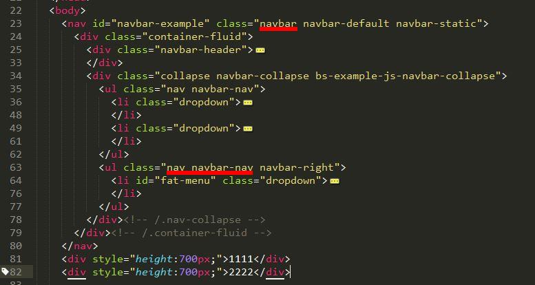
- 上述代碼,首先navbar 的父容器要應用 「.navbar」的樣式,其次頂級ul塊上要應用「.nav」「.navbar-nav」樣式。「下拉選單3」應用了「navbar-right」,就變成了「向右浮動對齊」
- download插件在網頁加載的時候,對所有「data-toggle="dropdown"」的樣式元素進行綁定
- 用戶單擊帶有「data-toggle="dropdown"」樣式的鏈接或按鈕,觸發javascript事件代碼
- javascript事件代碼在父容器「<li class="dropdown">」上加一個 .open樣式
- 默認隱藏的「‧dropdown-menu」選單在外部有了 .open樣式後,即可顯示出來,而達到預期的效果
- 「.navbar-fixed-top」固定在上方、「.navbar-fixed-bottom」固定在下方
- 教學:https://pjchender.blogspot.tw/2015/04/bootstraptabsnavigation-bar.html
二、滾動監聽
- 源文件:scrollspy.js
- 滾動監聽(scrollspy)插件是根據滾動位置自動更新導航條中相應的導航項
- 指定滾動區:data-spy="scroll"
- 指定作用的導航列:data-target=".navbar"
- 指定位移px:data-offset="50"
- 以上通常是對「body」元素設定:<body data-spy="scroll" data-target=".navbar" data-offset="50">
- nav
<nav class="navbar navbar-inverse navbar-fixed-top"> <div class="container"> <div class="navbar-header"> <button type="button" class="navbar-toggle" data-toggle="collapse" data-target="#myNavbar"> <span class="icon-bar"></span> <span class="icon-bar"></span> <span class="icon-bar"></span> </button> <a class="navbar-brand" href="#">網站標題</a> </div> <div> <div class="collapse navbar-collapse" id="myNavbar"> <ul class="nav navbar-nav"> <li><a href="#section1">區塊 1</a></li> <li><a href="#section2">區塊 2</a></li> <li><a href="#section3">區塊 3</a></li> <li class="dropdown"><a class="dropdown-toggle" data-toggle="dropdown" href="#">區塊 4 <span class="caret"></span></a> <ul class="dropdown-menu"> <li><a href="#section41">區塊 4-1</a></li> <li><a href="#section42">區塊 4-2</a></li> </ul> </li> </ul> </div> </div> </div> </nav> - 內容
<div id="section1" class="container"> <h1>區塊 1</h1> <p>Try to scroll this section and look at the navigation bar while scrolling! Try to scroll this section and look at the navigation bar while scrolling!</p> <p>Try to scroll this section and look at the navigation bar while scrolling! Try to scroll this section and look at the navigation bar while scrolling!</p> </div> <div id="section2" class="container"> <h1>區塊 2</h1> <p>Try to scroll this section and look at the navigation bar while scrolling! Try to scroll this section and look at the navigation bar while scrolling!</p> <p>Try to scroll this section and look at the navigation bar while scrolling! Try to scroll this section and look at the navigation bar while scrolling!</p> </div> <div id="section3" class="container"> <h1>區塊 3</h1> <p>Try to scroll this section and look at the navigation bar while scrolling! Try to scroll this section and look at the navigation bar while scrolling!</p> <p>Try to scroll this section and look at the navigation bar while scrolling! Try to scroll this section and look at the navigation bar while scrolling!</p> </div> <div id="section41" class="container"> <h1>區塊 4 Submenu 1</h1> <p>Try to scroll this section and look at the navigation bar while scrolling! Try to scroll this section and look at the navigation bar while scrolling!</p> <p>Try to scroll this section and look at the navigation bar while scrolling! Try to scroll this section and look at the navigation bar while scrolling!</p> </div> <div id="section42" class="container"> <h1>區塊 4 Submenu 2</h1> <p>Try to scroll this section and look at the navigation bar while scrolling! Try to scroll this section and look at the navigation bar while scrolling!</p> <p>Try to scroll this section and look at the navigation bar while scrolling! Try to scroll this section and look at the navigation bar while scrolling!</p> </div> - css
<style> body { position: relative; } #section1 {padding-top:50px;height:500px;color: #fff; background-color: #1E88E5;} #section2 {padding-top:50px;height:500px;color: #fff; background-color: #673ab7;} #section3 {padding-top:50px;height:500px;color: #fff; background-color: #ff9800;} #section41 {padding-top:50px;height:500px;color: #fff; background-color: #00bcd4;} #section42 {padding-top:50px;height:500px;color: #fff; background-color: #009688;} </style> - 實例:http://tncomu10601.ugm.com.tw/web/12-2.html
三、標籤頁
- 源文件:tab.js
- 標籤頁是我們常用的功能,單擊一個標籤,下面就顯示對應的標籤頁面
- 添加
data-toggle="tab"到每個選項卡,並添加一個.tab-pane類為每個標籤的唯一ID,並在將它們包裝.tab-content類。 - 代碼:
<div class="container"> <h2>標籤頁</h2> <ul class="nav nav-tabs"> <li class="active"><a data-toggle="tab" href="#home">Home</a></li> <li><a data-toggle="tab" href="#menu1">Menu 1</a></li> <li><a data-toggle="tab" href="#menu2">Menu 2</a></li> <li><a data-toggle="tab" href="#menu3">Menu 3</a></li> </ul> <div class="tab-content"> <div id="home" class="tab-pane fade in active"> <h3>HOME</h3> <p>Lorem ipsum dolor sit amet, consectetur adipisicing elit, sed do eiusmod tempor incididunt ut labore et dolore magna aliqua.</p> </div> <div id="menu1" class="tab-pane fade"> <h3>Menu 1</h3> <p>Ut enim ad minim veniam, quis nostrud exercitation ullamco laboris nisi ut aliquip ex ea commodo consequat.</p> </div> <div id="menu2" class="tab-pane fade"> <h3>Menu 2</h3> <p>Sed ut perspiciatis unde omnis iste natus error sit voluptatem accusantium doloremque laudantium, totam rem aperiam.</p> </div> <div id="menu3" class="tab-pane fade"> <h3>Menu 3</h3> <p>Eaque ipsa quae ab illo inventore veritatis et quasi architecto beatae vitae dicta sunt explicabo.</p> </div> </div> </div> - 實例:http://tncomu10601.ugm.com.tw/web/12-3.html
四、工具提示
- 文源件:tooltip.js
- 提示框(tooltip)也是一個比較常見的功能,一般來說是鼠標移到特定的元素上時,顯示相關的提示語
- 該
data-toggle="tooltip"激活提示。 - 該
title屬性指定要在工具提示中顯示的文本。 - 提示不僅是CSS-插件,因此必須用jQuery初始化:選擇指定的元素並調用
tooltip()方法。 - 代碼
<div class="container"> <h3>Tooltip Example</h3> <p>Tooltips are not CSS-only plugins, and must therefore be initialized with jQuery: select the specified element and call the tooltip() method.</p> <a href="#" data-toggle="tooltip" title="Hooray!" class="tool_tip">Hover over me</a> <h3>工具提示範例2</h3> <p>Tooltips are not CSS-only plugins, and must therefore be initialized with jQuery: select the specified element and call the tooltip() method.</p> <a href="#" data-toggle="tooltip" title="工具提示範例2!" class="tool_tip">Hover over me</a> </div> <script> $(document).ready(function(){ $('.tool_tip').tooltip(); }); </script> - 實例:http://tncomu10601.ugm.com.tw/web/12-4.html
五、折疊:http://tncomu10601.ugm.com.tw/web/12-5.html
- 手風琴
<div class="panel-group" id="accordion">
  <div class="panel panel-default">
    <div class="panel-heading">
      <h4 class="panel-title">
        <a data-toggle="collapse" data-parent="#accordion" href="#collapse1">
        Collapsible Group 1</a>
      </h4>
    </div>
    <div id="collapse1" class="panel-collapse collapse in">
      <div class="panel-body">Lorem ipsum dolor sit amet, consectetur adipisicing elit,
      sed do eiusmod tempor incididunt ut labore et dolore magna aliqua. Ut enim ad
      minim veniam, quis nostrud exercitation ullamco laboris nisi ut aliquip ex ea
      commodo consequat.</div>
    </div>
  </div>
  <div class="panel panel-default">
    <div class="panel-heading">
      <h4 class="panel-title">
        <a data-toggle="collapse" data-parent="#accordion" href="#collapse2">
        Collapsible Group 2</a>
      </h4>
    </div>
    <div id="collapse2" class="panel-collapse collapse">
      <div class="panel-body">Lorem ipsum dolor sit amet, consectetur adipisicing elit,
      sed do eiusmod tempor incididunt ut labore et dolore magna aliqua. Ut enim ad
      minim veniam, quis nostrud exercitation ullamco laboris nisi ut aliquip ex ea
      commodo consequat.</div>
    </div>
  </div>
  <div class="panel panel-default">
    <div class="panel-heading">
      <h4 class="panel-title">
        <a data-toggle="collapse" data-parent="#accordion" href="#collapse3">
        Collapsible Group 3</a>
      </h4>
    </div>
    <div id="collapse3" class="panel-collapse collapse">
      <div class="panel-body">Lorem ipsum dolor sit amet, consectetur adipisicing elit,
      sed do eiusmod tempor incididunt ut labore et dolore magna aliqua. Ut enim ad
      minim veniam, quis nostrud exercitation ullamco laboris nisi ut aliquip ex ea
      commodo consequat.</div>
    </div>
  </div>
</div>